08Brand Foundation + Digital Launch
SSCRE
Phase 1
A complete identity system built to remain disciplined in formal environments and flexible across fast-moving digital content.
01System at a glanceFOUNDATION / 2025
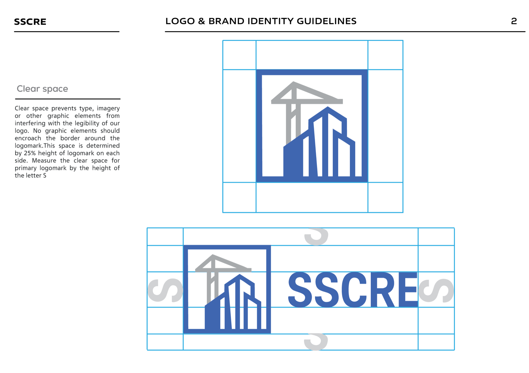
02The foundationSTRUCTURE + FLEXIBILITY
The approach
A serious CRE identity, built to move.
The brand system balances structure with flexibility, positioning SSCRE as a trustworthy commercial real estate presence without limiting the visual range needed for listings and social media.
The result is more than a visual identity. It is a scalable operating system for signage, legal documents, digital listings, social content, and future creative partners.
03What the system deliversBRAND TOOLKIT
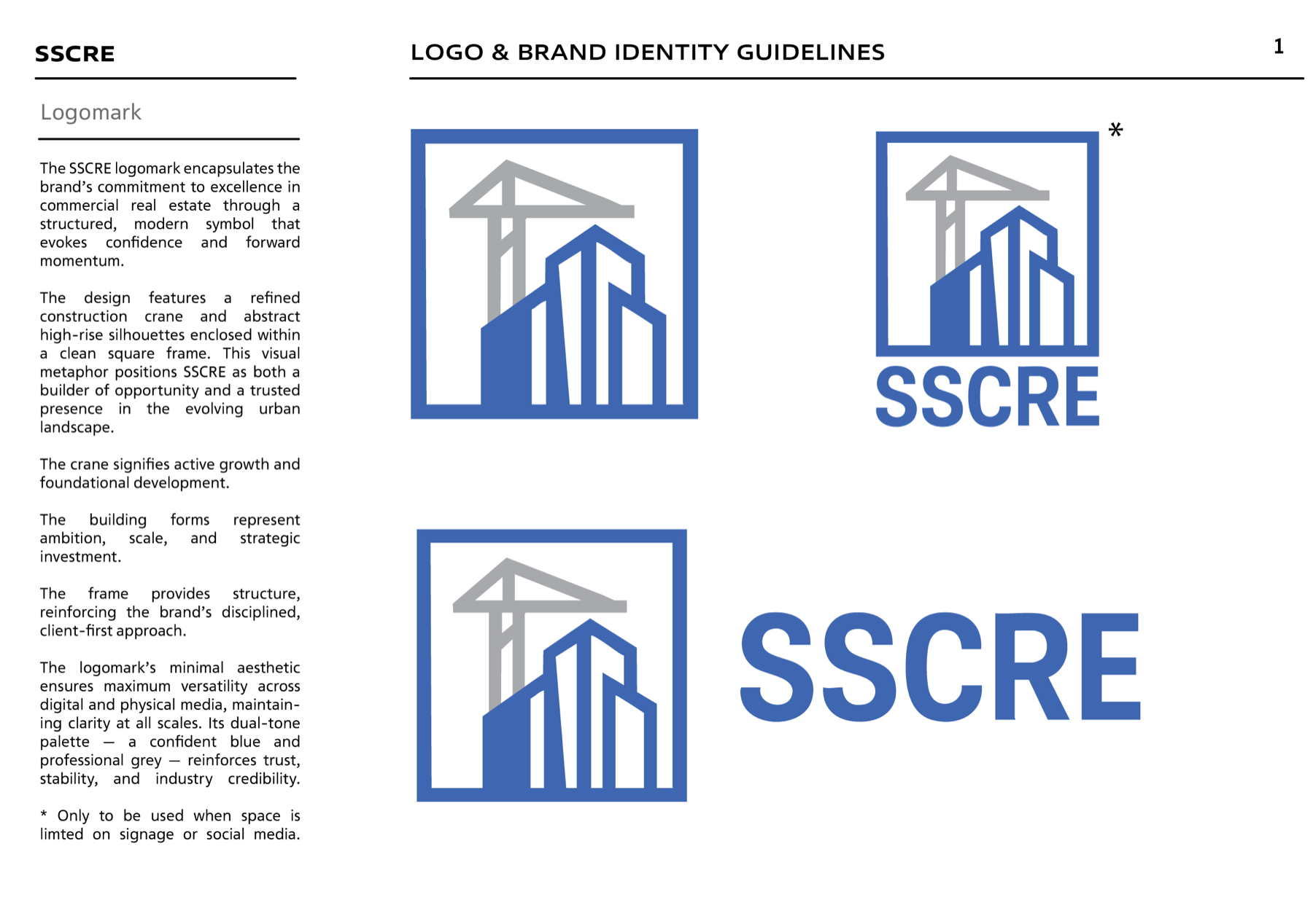
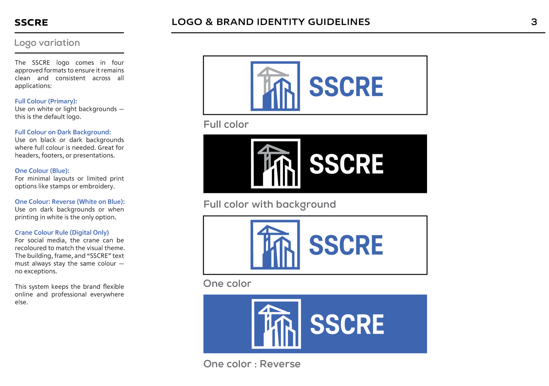
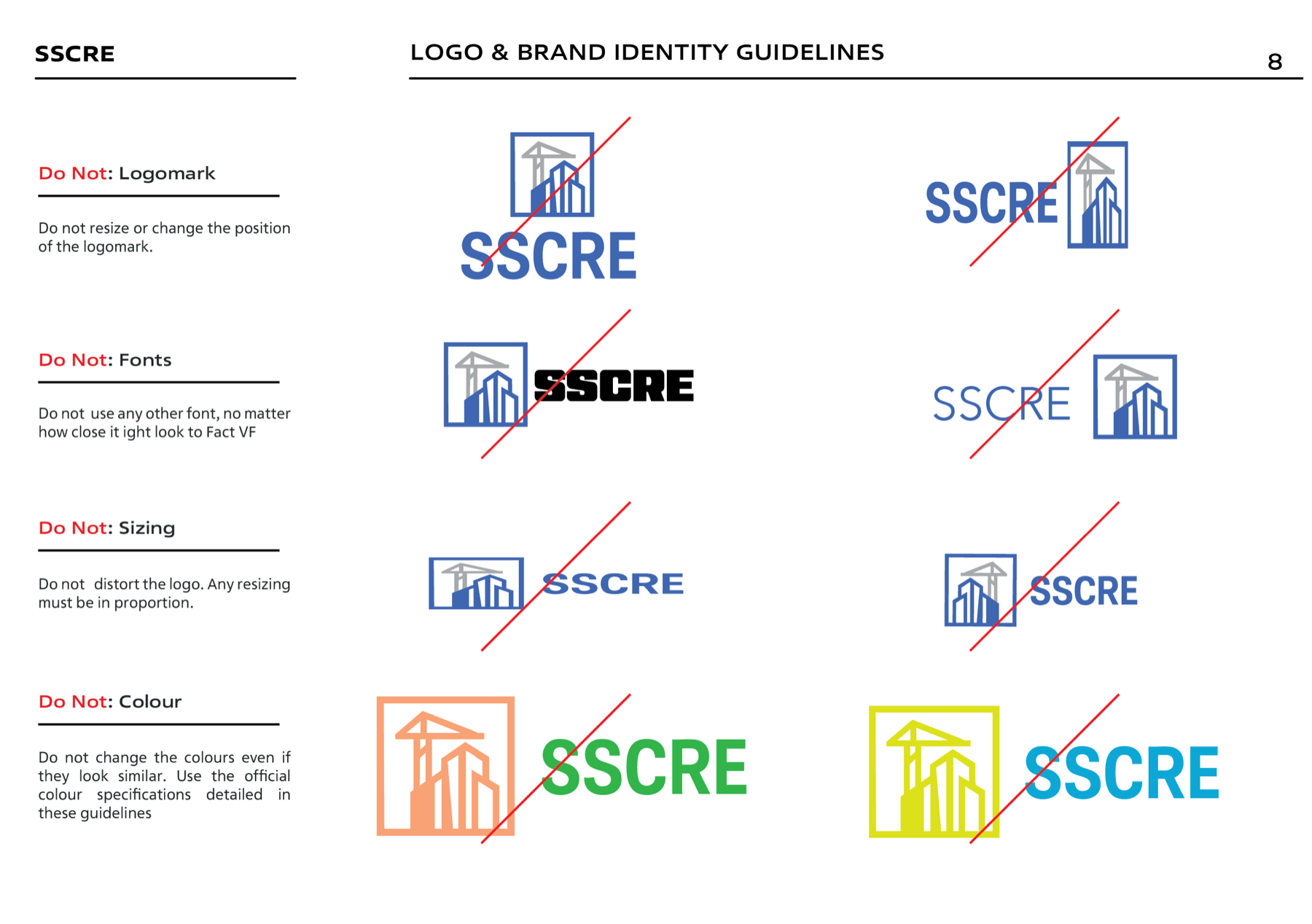
Modular logo system
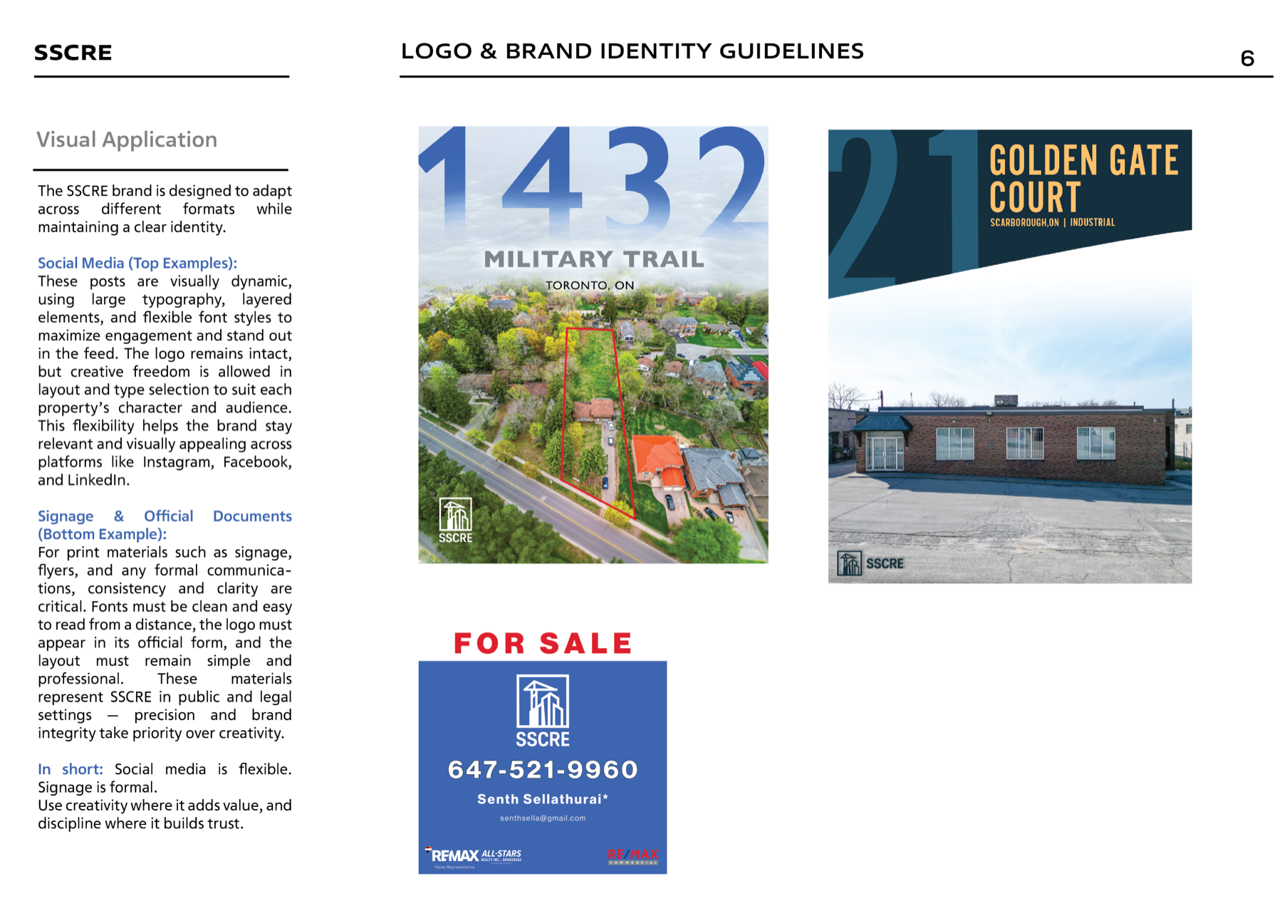
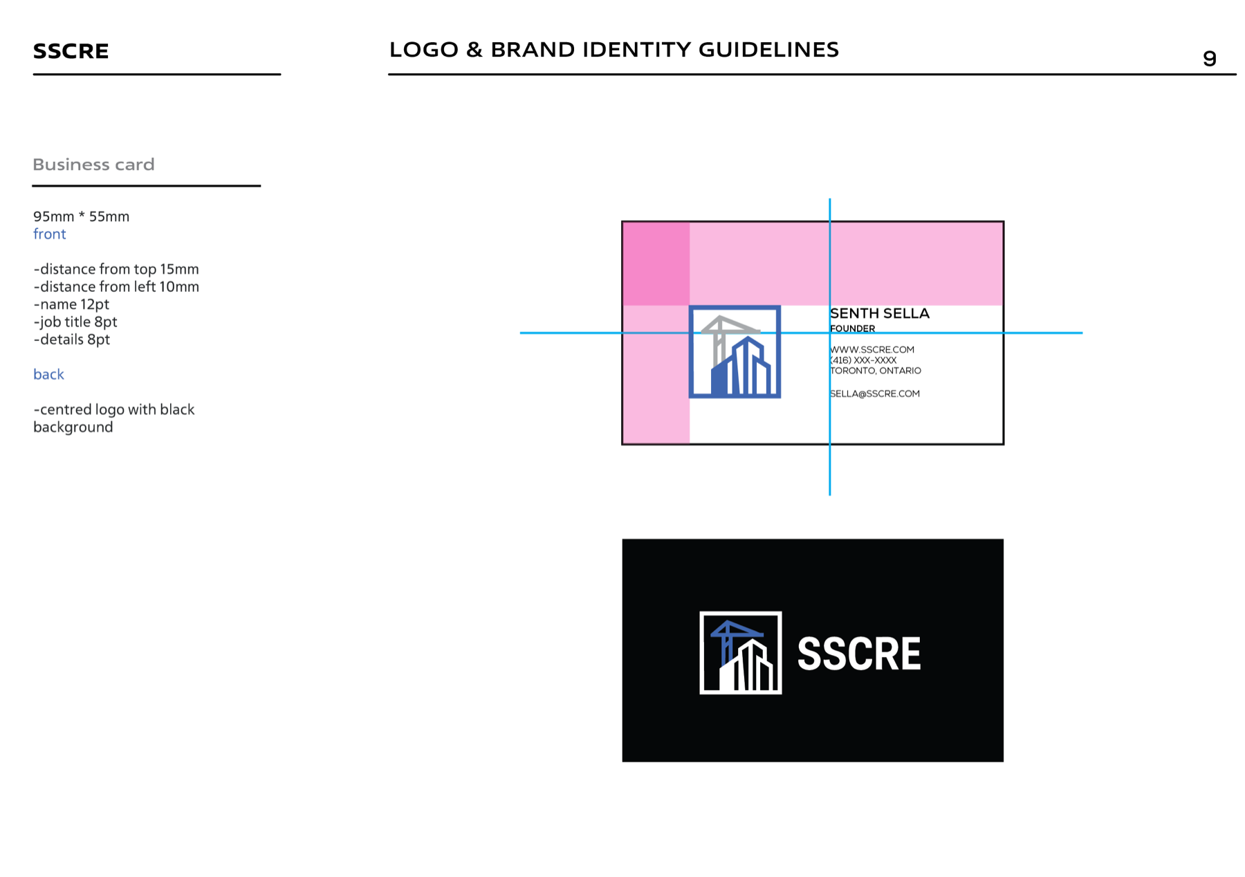
A flexible lockup family maintains recognition across compact digital placements, signage, and full-format documents.
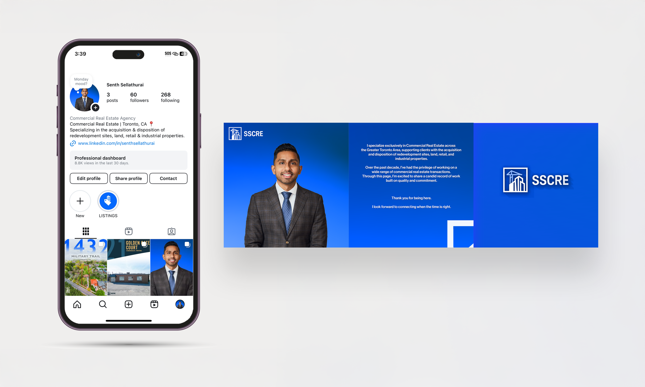
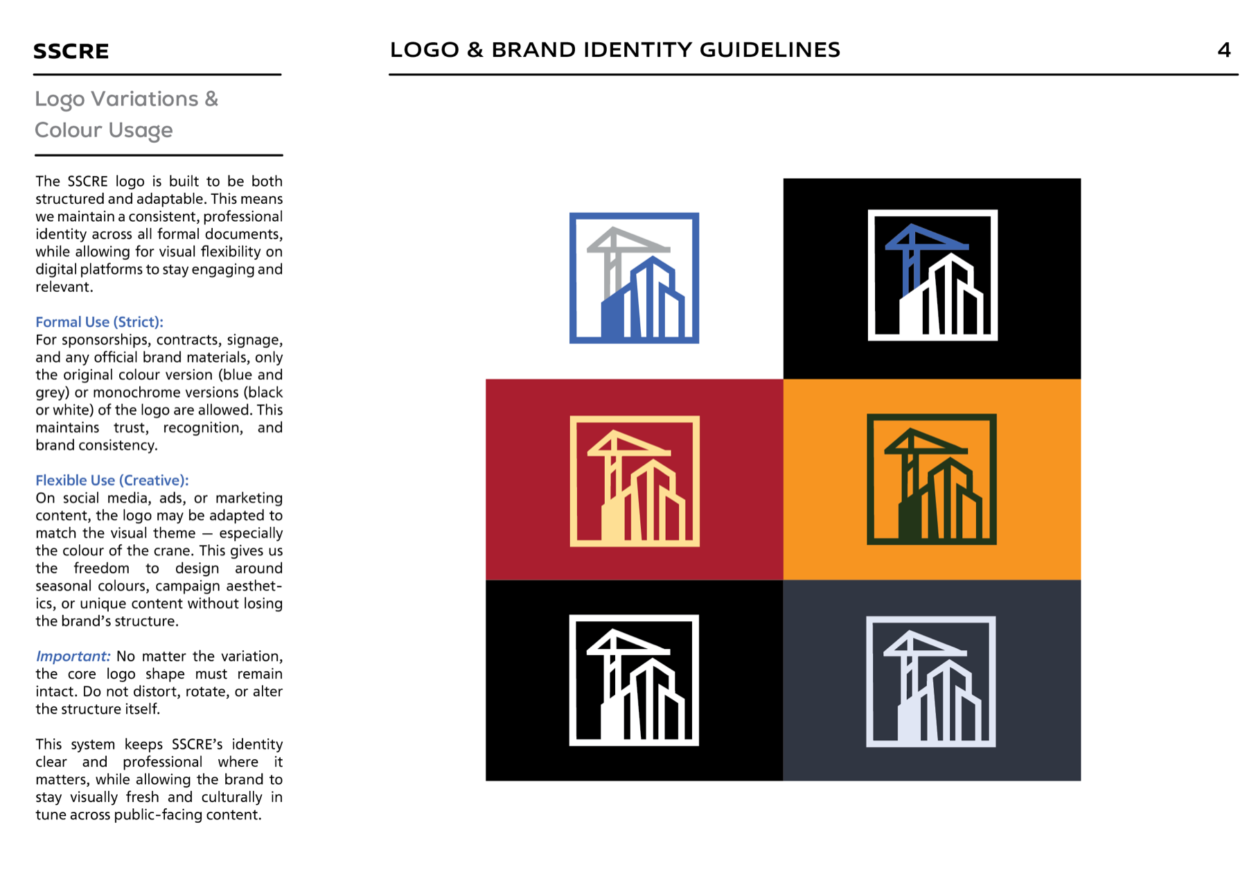
Dynamic crane rule
Social content can recolour the crane to support the campaign theme while the building, frame, and wordmark stay controlled.
Approved variations
Full-colour, reverse, and monochrome versions preserve legibility across light, dark, print, and digital environments.
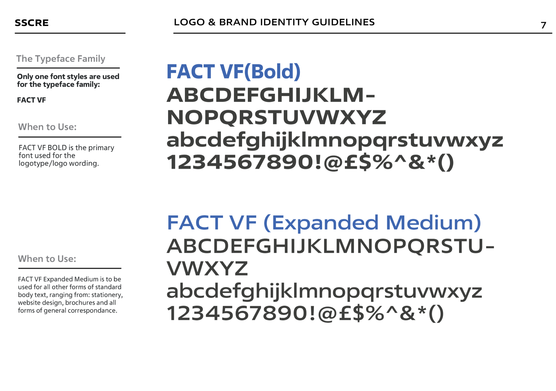
Typography hierarchy
Defined type roles, spacing, and layout behaviour make dense property information easier to scan and trust.
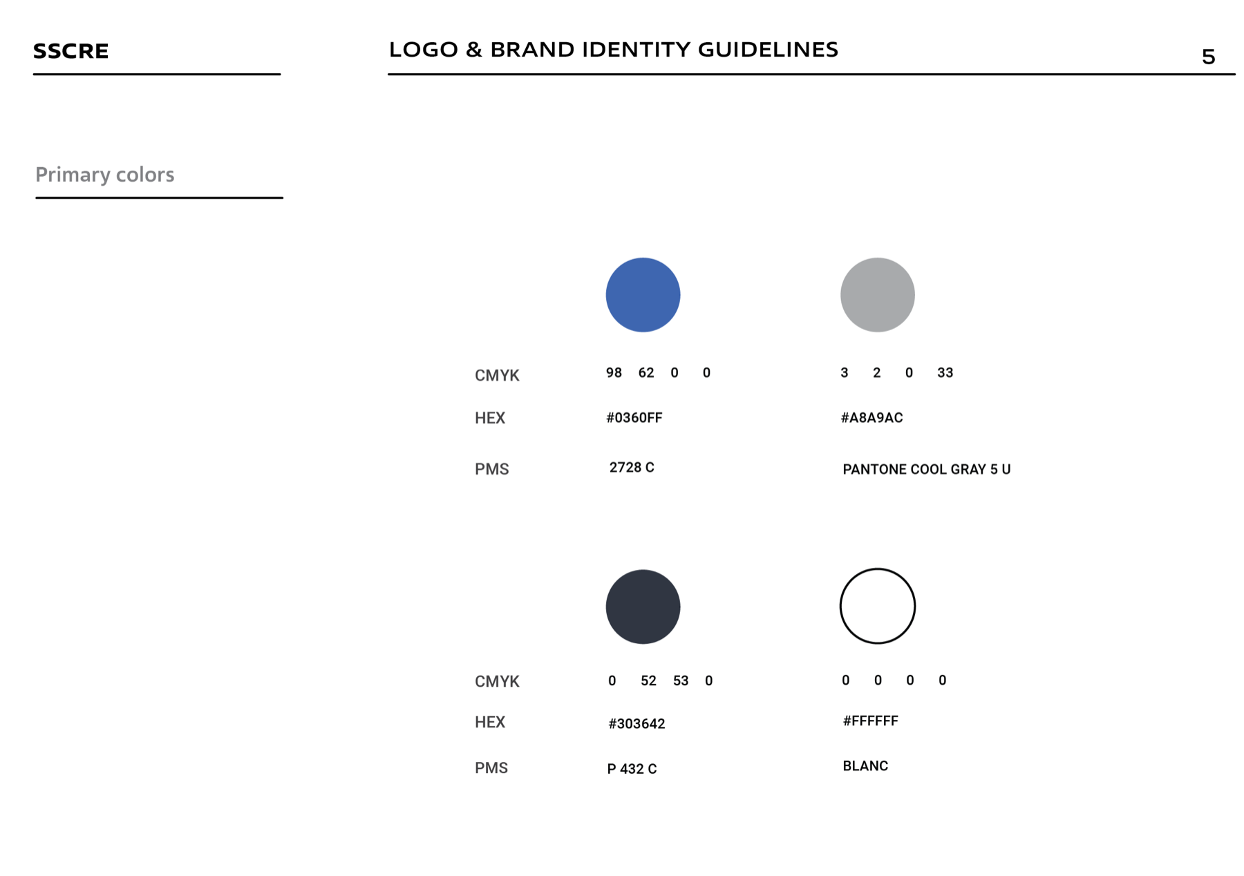
Purpose-built palette
Blue signals trust and momentum, balanced by structural charcoal, professional grey, and clean white.
Handoff-ready guide
A documented system gives future designers, partners, and teams clear rules for extending the brand correctly.
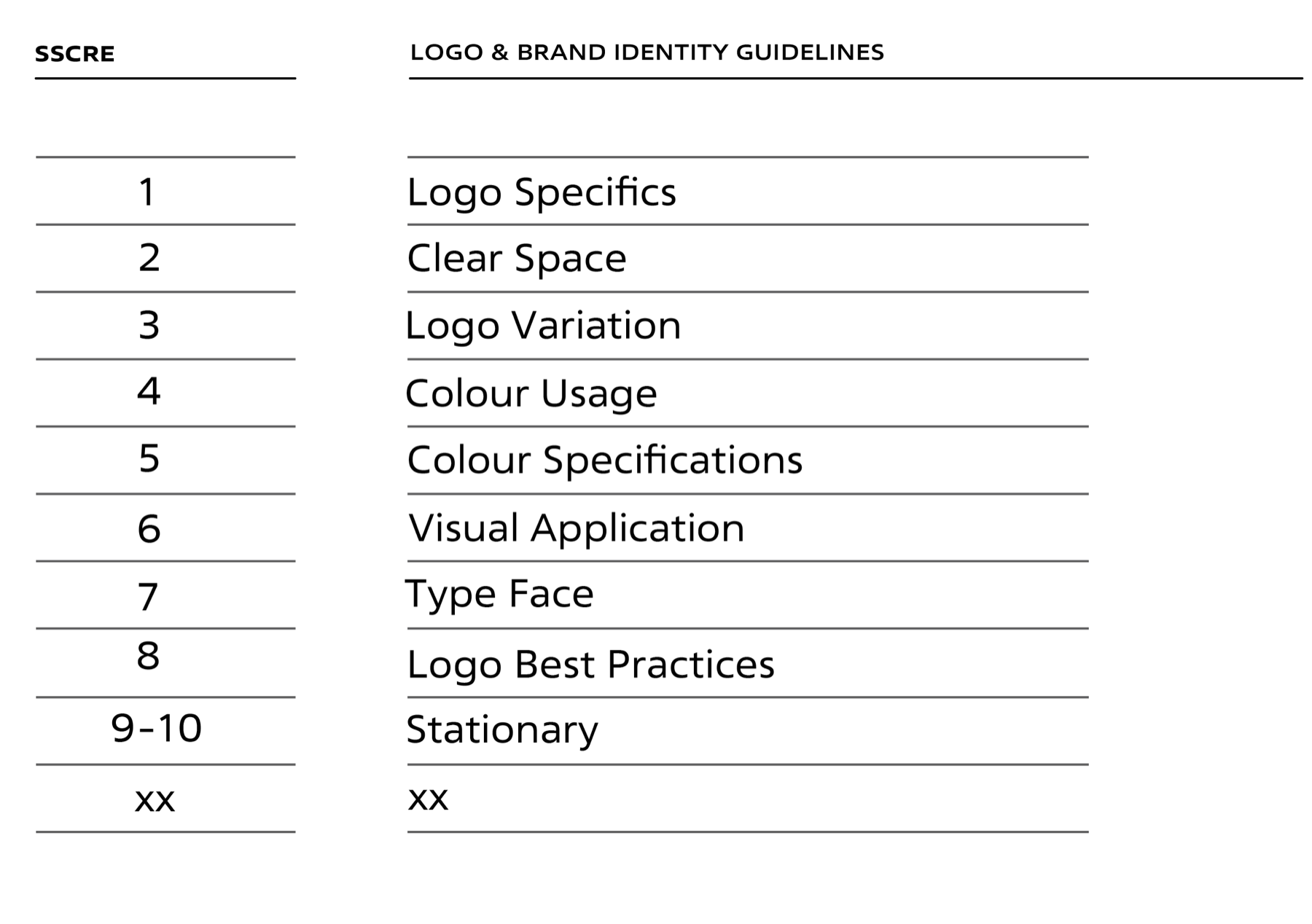
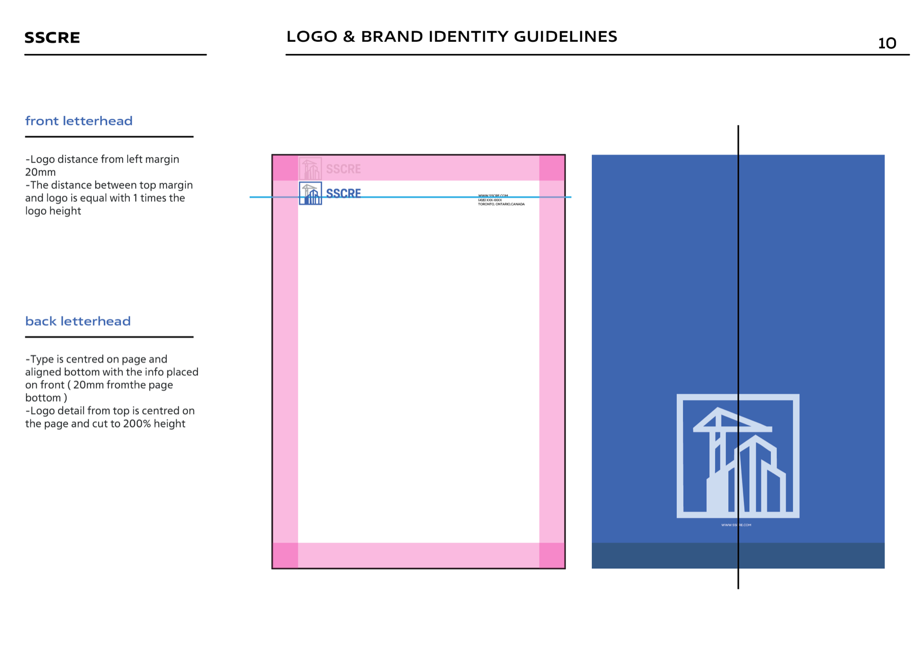
04The 12-page brand guideSCROLL TO BROWSE →
Rules designed for real-world handoff.
The guide covers logo logic, clear space, variations, colour specifications, visual applications, typography, misuse, and stationery. Scroll horizontally to inspect the complete system.
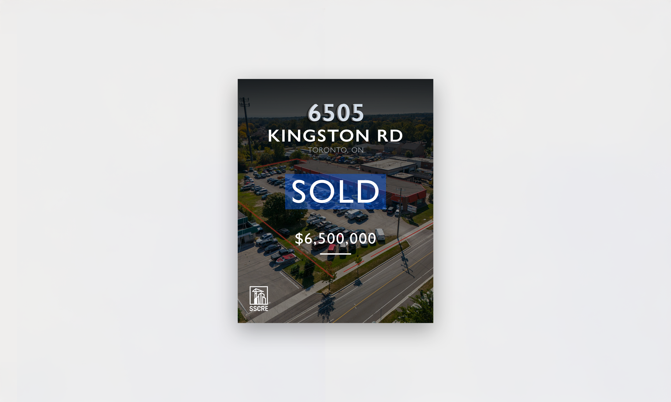
05Controlled flexibilityFORMAL / FLEXIBLE
One system, two behaviours
Discipline where trust matters. Creative range where attention matters.
Signage, legal materials, sponsorships, and official documents use strict approved versions. Social media and campaign content gain carefully defined flexibility, especially through the crane colour rule.
06Social media launchDIGITAL DEPLOYMENT
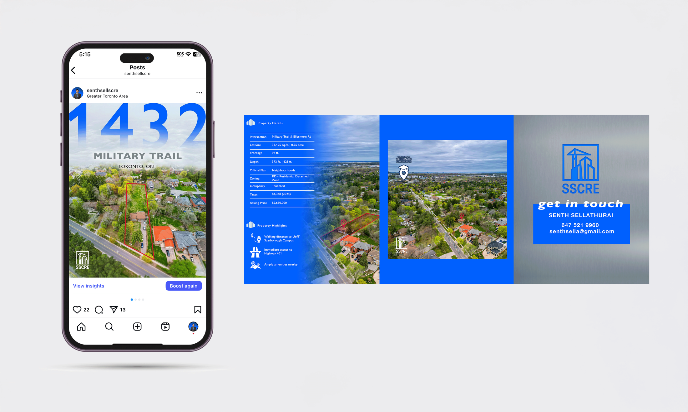
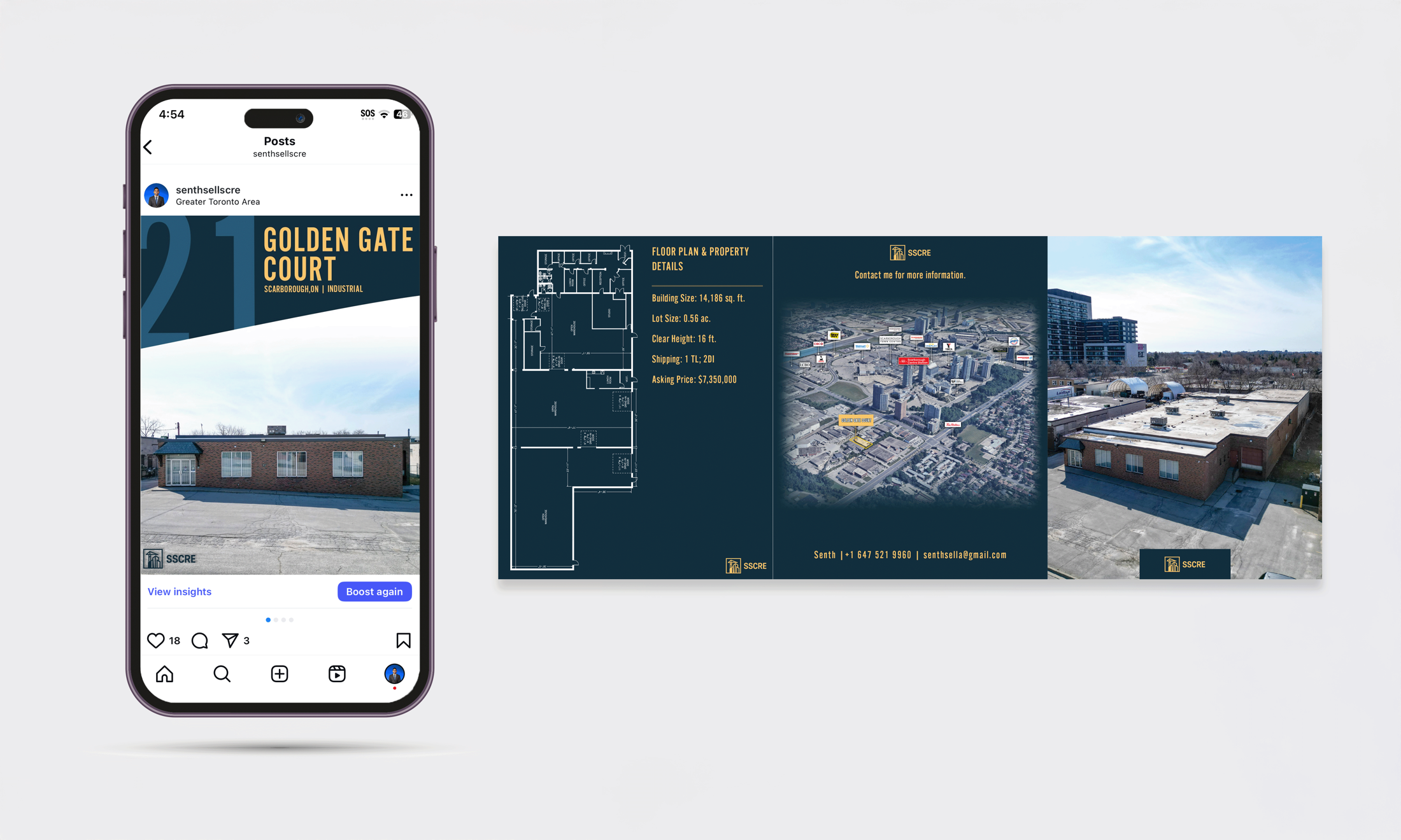
Outcome
One cohesive identity across every place credibility is built.
SSCRE now operates with a professional system that is structured in documents and signage, responsive in digital content, and clear enough for future teams to extend without weakening the brand.
Scalable
Adaptable
Handoff-ready
Built for growth